One of the few assignments we had to make in Ceramics 165 were hollowed objects. The instructions was to make five or more hollowed forms and combine them in a unique way. I think this assignment gave me the most trouble because I did not know what shapes and forms would look well together. I also had a hard time with color because I did not know what color combination looked well- balanced. Although this assignment was a challenge I learned a lot about the glazes and refined my techniques with clay. The picture below shows one of the forms in the art show and this piece in particular compared to the other two, I believe to be my best because of the color, design, and form it takes.
 |
| I really love how the swirls turned out. Black oxide wash was used inside the gaps of the swirls and it brings out the green that was glazed on. |
 |
| I like this piece a lot because of the negative space this work shows and the form itself is strange, yet intriguing. |
 | ||
These are the other two forms I made; however, I do not find them as good as the previous pictures.
 This form started off with a round surface stacked onto a box shaped form; however, the form itself did not look interesting so I added an outer rim to the face shaped form.  The more I look at the back, the more I am intrigued by the colors. It was originally glazed by different shades of green, but I ended up using black oxide wash on the whole thing except the front face part. Some of the black oxide got smeared off so there is some parts in the back that shows the green as well. I find this look very interesting and fun to look at. 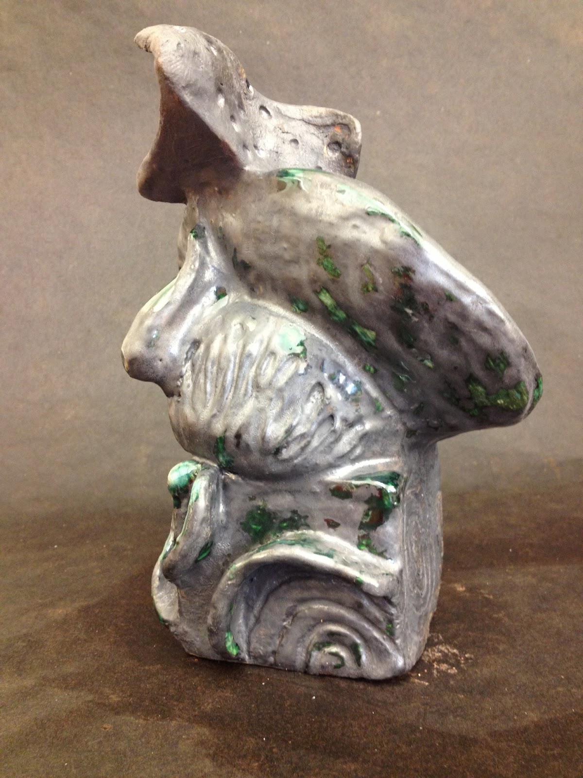 From this angle, you can see the parts of the black oxide smeared off. This effect looks like the inside of an oyster shell and the different colors is shown in contrast to the rough dark color.
Another assignment we were heavily involved in was platter making. One platter involved experimenting with majolica glaze. Another with carving into the clay and lastly making a platter however way you want.

The platter on the left is a carved platter that I made with purple slip and after it got fired I added a layer of black under-glaze plus clear glaze. The words that are written into the platter is a parts from a song that stood out to me; the song title is "I'm Gonna Fly". The platter on the right is my majolica platter. I wanted to represent the mindmaps Professor Geffen had us do in the beginning of the semester. I went through a lot of trials to get this platter to look the way it looks now. The words were flowers and written with black stain, but I did not like how it turned out so I redid the design. I took a sponge to erase the flowers and writing and in doing so it created a cool watercolor look in the background and instead of flowers I made blobs of stain and carved out the words with a sharp tool. I am proud of what I produced with these two platters. :)
 This is a carved platter before it was fired. 
These were studies of the carving platters. I enjoyed making both platters; however, I favor the one on the left more because the result came out the way I wanted it to happen. I put some black oxide wash and clear glaze onto the platter, but the clear glaze seeped into the carved words so it is hard to read the words that were originally carved. The end result, there are SOME words that are legible. (The words that are easy to read are the ones that were carved deeply).

These were experiments with majolica glaze. These platters were not bisque before applying majolica glaze. It started to crumble apart so I decided to break away the edges and continue to play with it. I experimented more with the writing on the majolica.

This was purple and black stain on the majolica glaze. I wrote out the names of my closest friends and at the bottom wrote "Constellations of Friends" but because the platter was not bisque before applying the glaze the words are not a visible as I hoped it would be; however, the effects of this platter still amazes me. Luckily, most of the names are visible to see and I like the chaotic look of this piece. I love majolica :)

I used the lyrics of "Hurt" by Christina Aguilera because I painted the whole platter with black stain and these lyrics relates to the dark because of its negativity. I wish the words were visible because I liked the way this platter was shaped and I thought the lyrics fitted in with the whole design; however, the "chaoticness" of this platter resonates with the negativity the way the lyrics were written.

This test platter may be my favorite out of all of the majolica platters I made this semester because of the randomness of it. I like how this lightly black stain looks bluish-gray and how in some areas show soft and hard colors. I gave this picture another look and I see a face in the platter. The two circular black areas look like the eyes and from there and down looks like a portrait of a person. I love this platter because of the mysterious look it brings. It makes me want to know whats beyond the mysterious face.
 This was originally a platter, but unfortunately it crumbled a part because the base support was weak. When I found my platter broken I saw the left overs and this is what was remaining. I thought to myself " How lucky could I get??" I thought the way it was broken was beautiful and natural. I decided to keep it the way it was broken. I think it look beautiful. I also enjoyed making this piece. The shape of the whole thing looks like Africa. It is a very random statement to say, but it is the first thing that came up in my mind. I left it the original color because I did not want to alter its natural aesthetic. In a way I am happy that this accident happened because I made me appreciate art more because of the process. Art-making process can be challenging and frustrating, but it makes one's work worth the energy put into their work.  I wanted it to look like and angel with wings sleeping, but it can be an angel without wings :) "angels without wings are also referred to as FRIENDS" -unknown 
Object Narrative: Picking an object and tell a story. For my object, I picked a thread spool. I took an FS class "Quilting, Story Telling, and Social Change", that included quilting and so I decided to make this thread spool with related materials to sewing like buttons, ribbons, fabric, and a needle.

I had a lot of difficulty glazing because I merged the objects with the basket. I took a lot of random colors and decorated each button a different color and pattern. I am proud of the hours I work on the inside of the basket because it was a challenge to paint the space between each object. I also like how the color lures you in, it is a nice contrast to the dull, dark color on the outside.

I took a lot of copper-colored wire and made them look like the thread on the spool. I also took the wire and made the word "Button". Overall, I am happy with the end result of this assignment.
    
Great end to Freshman year in Ceramics!!!! THANKS!!!!
|

No comments:
Post a Comment