Saturday, April 27, 2013

Semester Assignments


One of the few assignments we had to make in Ceramics 165 were hollowed objects.  The instructions was to make five or more hollowed forms and combine them in a unique way.  I think this assignment gave me the most trouble because I did not know what shapes and forms would look well together.  I also had a hard time with color because I did not know what color combination looked well- balanced.  Although this assignment was  a challenge I learned a lot about the glazes and refined my techniques with clay.  The picture below shows one of the forms in the art show and this piece in particular compared to the other two, I believe to be my best because of the color, design, and form it takes.  

I really love how the swirls turned out.  Black oxide wash was used inside the gaps of the swirls and it brings out the green that was glazed on.  

I like this piece a lot because of the negative space this work shows and the form itself is strange, yet intriguing.  


These are the other two forms I made; however, I do not find them as good as the previous pictures.
       
   I started off with an oval shaped form and added some swirls that go all the way around.   It was suggested that I made the swirls go further than where they lead to now.  In the end, I was proud of the end product.  


This form started off with a round surface stacked onto a box shaped form; however, the form itself did not look interesting so I added an outer rim to the face shaped form.


The more I look at the back, the more I am intrigued by the colors.  It was originally glazed by different shades of green, but I ended up using black oxide wash on the whole thing except the front face part.  Some of the black oxide got smeared off so there is some parts in the back that shows the green as well.  I find this look very interesting and fun to look at.


From this angle, you can see the parts of the black oxide smeared off. This effect looks like the inside of an oyster shell and the different colors is shown in contrast to the rough dark color.


Another assignment we were heavily involved in was platter making.  One platter involved experimenting with majolica glaze.  Another with carving into the clay and lastly making a platter however way you want.  


The platter on the left is a carved platter that I made with purple slip and after it got fired I added a layer of black under-glaze plus clear glaze.  The words that are written into the platter is a parts from a song that stood out to me; the song title is "I'm Gonna Fly".  The platter on the right is my majolica platter.  I wanted to represent the mindmaps Professor Geffen had us do in the beginning of  the semester.  I went through a lot of trials to get this platter to look the way it looks now.  The words were flowers and written with black stain, but I did not like how it turned out so I redid the design.  I took a sponge to erase the flowers and writing and in doing so it created a cool watercolor look in the background and instead of flowers I made blobs of stain and carved out the words with a sharp tool.  I am proud of what I produced with these two platters. :)

This is a carved platter before it was fired.


These were studies of the carving platters.  I enjoyed making both platters; however, I favor the one on the left more because the result came out the way I wanted it to happen.  I put some black oxide wash and clear glaze onto the platter, but the clear glaze seeped into the carved words so it is hard to read the words that were originally carved.  The end result, there are SOME words that are legible. (The words that are easy to read are the ones that were carved deeply).  


These were experiments with majolica glaze. These platters were not bisque before applying majolica glaze.  It started to crumble apart so I decided to break away the edges and continue to play with it.  I experimented more with the writing on the majolica.  

This was purple and black stain on the majolica glaze. I wrote out the names of my closest friends and at the bottom wrote "Constellations of Friends" but because the platter was not bisque before applying the glaze the words are not a visible as I hoped it would be; however, the effects of this platter still amazes me. Luckily, most of the names are visible to see and I like the chaotic look of this piece.  I love majolica :)


I used the lyrics of "Hurt" by Christina Aguilera because I painted the whole platter with black stain and these lyrics relates to the dark because of its negativity.  I wish the words were visible because I liked the way this platter was shaped and I thought the lyrics fitted in with the whole design; however, the "chaoticness" of this platter resonates with the  negativity the way  the lyrics were written.  


This test platter may be my favorite out of all of the majolica platters I made this semester because of the randomness of it.  I like how this lightly black stain looks bluish-gray and how in some areas show soft and hard colors.  I gave this picture another look and I see a face in the platter.  The two circular black areas look like the eyes and from there and down looks like a portrait of a person.  I love this platter because of the mysterious look it brings.  It makes me want to know whats beyond the mysterious face.  


This was originally a platter, but unfortunately it crumbled a part because the base support was weak.  When I found my platter broken I saw the left overs and this is what was remaining. I thought to myself " How lucky could I get??" I thought the way it was broken was beautiful and natural.  I decided to keep it the way it was broken.  I think it look beautiful.  I also enjoyed making this piece.


The shape of the whole thing looks like Africa.  It is a very random statement to say, but it is the first thing that came up in my mind.  I left it the original color because I did not want to alter its natural aesthetic.  In a way I am happy that this accident happened because I made me appreciate art more because of the process.  Art-making process can be challenging and frustrating, but it makes one's work worth the energy put into their work.


I wanted it to look like and angel with wings sleeping, but it can be an angel without wings :)


"angels without wings are also referred to as FRIENDS"
-unknown


Object Narrative:  Picking an object and tell a story.  For my object, I picked a thread spool.  I took an FS class "Quilting, Story Telling, and Social Change", that included quilting and so I decided to make this thread spool with related materials to sewing like buttons, ribbons, fabric, and a needle.  

I had a lot of difficulty glazing because I merged the objects with the basket.  I took a lot of random colors and decorated each button a different color and pattern.  I am proud of the hours I work on the inside of the basket because it was a challenge to paint the space between each object.  I also like how the color lures you in, it is a nice contrast to the dull, dark color on the outside.    


I took a lot of copper-colored wire and made them look like the thread on the spool.  I also took the wire and made the word "Button".  Overall, I am happy with the end result of this assignment.  


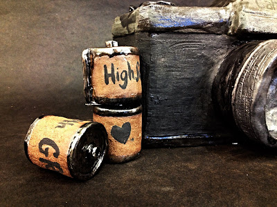
For my final we were to make a series of any object that is related to art and life.  I picked a camera and made a small series of film. On each film, I wrote specific memories that stuck to me the most in my life.  The roll that has the film coming out of it represents that memories are still being made and my life is not over yet.  I do wish that the camera color was a little lighter, but in this picture it looks lighter than it really is. Overall, this project turned out the way I wanted it to.  I am glad I got it done and I can say that I ended the semester with a bang with the project.


Great end to Freshman year in Ceramics!!!! THANKS!!!!


Friday, April 5, 2013

1960-Present Contemporary Ceramic Artists ( Matthew Chambers)

Matthew Chambers
The link that leads to the photos: http://www.ceramicsnow.org/tagged/Matthew+Chambers+Ceramics


This is the image that caught my attention as I was looking for artists to research.  This reminds me of a camera's lens.  

This work reminds me of a robot's eye.


Matthew began his journey in 1993 with a training in handmade tableware with Philip Wood in Nunney, the Somerset villiage where he grew up. His other education began in 1999 at Bath School of Art, followed with an MA at the Royal College of Art in London from 2002. He currently lives and makes on the Isle of Wight after moving there on a residency at Quay Arts in 2004.

His artworks stood out to me because of his use of repetition as well 3-dimensional art.  I picked Matthew Chambers' art to relate to mine because of the forms he makes.  For my final project I am making an old film Canon camera and when I saw these works I though that this style would be great to incorporate as lenses of the camera.  The lens of a camera is the most important part because it controls the focus and light of a picture.  The repetition of circles shows depth and would be a great representation of the lens of a camera.


Wednesday, April 3, 2013

Final Project

 For a final project, we need to make a series of objects out of clay (objects, platters, etc.) and integrate art and life in a way that is meaningful to us and I picked a camera  as final object for this assignment.  I picked a camera because of its capability of capturing precious memories in my life.  Besides my brain, which contains all of my memories since I was born, I have another vessel to preserve memories that I can see as well.
My idea was to create a film camera out of clay.  An issue I had with building this was the size of the camera lens.  The lens is too small for the body of the camera.

A bird's eye view of the camera.


A side view of the camera.

Due to the small size of the lens, I decided to rebuild the lens onto the body.  The pictures below show the change in size of the lens and a few details added.

This is the rebuilt camera with a bigger lens.  Due to the change the body and lens look proportional to each other.  Beside the size change, details have been added to the camera as well.


This is an arial view of the new camera.


This is the side view of the camera.  More functions of the camera was added.

The pictures below also show the forms films for the camera.


In my original idea, I wanted to take the middle of the film and paint a picture of the memories that stand out to me the most in my life; However, due to the limited time period I was only able to write out the specific occasion onto the films.  


Art Show

I submitted two works I have done within this semester.
I was going into the art show not expecting much because I was going up against a lot of students.
These are the two works I submitted into the show:

I like how this platter came out; however, I regret doing a second firing because of that there are more white dots shown from it.  Lesson learned, but I am still proud of this piece anyways! :)

I am extremely proud at how I did in the art show with this piece.  I did not expect anyone to like this piece so much that it would be purchased and shown in display in Allegheny College. I felt very privileged to have been chosen to be a part of the show and this experience helped me to be more confident about my works.

This was a great experience and I have no regrets from it :) 

Friday, March 29, 2013

Object Narrative

For this project we were required to bring in objects that carry some kind of significance
your life.

I struggled in finding an object and brought in a necklace that I got over winter break.
But if I were to make this out of clay it would be very difficult to make the chain of the necklace; however, I could carve a clump of clay to look like a chain, but I decided to bring in or think of
another object.

I was brought back to my mind map that was still pinned on the wall.
I am referring to the thread spool.
I am currently in FS 102,20 "Quilting and Social Change" with Professor Ozorack
I am having fun sewing and quilting pieces of fabric together and the colors are fun to mix match and I thought the spool of thread would be interesting to make out of clay with other sewing tools

So I decided that I would make a big basket with a spool, fabric, ribbon, sewing needle, needle tomato cushion, and a lot of buttons.  


Friday, February 15, 2013

Inspirational designs and artists


For homework, I looked up some artists and their platters and there are some that really caught my eye.

Ralph Bacerra, (this platter did not come with a specific name) and I LOVE this platter because of the different colors and fluidity of the lines that are compacted into circular plane.  The colors of red, yellow, blue, and a hint of black and gold are used very well together and it creates a sense of of harmony because of the geometric and organic shapes put together. It looks chaotic because of the clash of colors.
LINK: http://www.artscenecal.com/Announcements/2008/1108/PalosVerdesAC1108.html

Laney X. Oxman, this is not my all time favorite, but I picked this platter because it reminded me of the class discussion about mind maps and self portraits.  There are many faces painted on and the color choices seem to be very personal choice for making this design.
LINK: http://pinterest.com/pin/188869778093840669/

David McDonald, "Shield Mandalas", this is a very interesting design and texture for a platter.  I am so intrigued by the texture he made and how it repeats itself around the whole thing and the color choice is very subtle and neutral.  The focal spot is the dark brown circle in the middle which is where I am drawn to first and from there you follow a radial effect until you get to the rim of the platter.
LINK: http://limberlostpottery.com/home.htm


Platters and Mind Maps

My next assigned project for Ceramics is to create 3 or more platters and develop these platters by doing three methods of painting and carving our designs on our platters.
  • majolica 
  • slip painted (while clay is still leatherhard)
  • carved and/or pressed clay
So the pictures below are the platters I made for this project.

The side view of the triangular bottom.  I plan to make this platter the one where I will carve /press this platter.  


This is the first platter that I made and I have it under the heat lamp so it can dry faster and get to a bone-dry state for the majolica painting.  

I made it as smooth as possible so it is easier to paint slip on.  

I gave this platter a traditional circular bottom. It is also a smooth texture on the outside part of this platter.  

After this platter dried past leatherhard, I painted it with underglaze and this texture reminded me of fish scales which led me to think about Rainbow Fish, the childhood story that I kept close to my memories :) ~Sharing is caring!

This is the aerial view of the same platter.  It does relate to the texture underneath because of the fish-like theme; however, I was advised that the color choice does not bring them together as ONE platter.  One option is to bring a color from either side and incorporate it onto the platter.  

My carved platter was suppose to symbolize the lines the tree creates because of the bark.  The words I wrote and I made the lines are key words that remind me of something precious and nostalgic about my life.  Family is indented the deepest due to the fact that Family is the most important thing to me in my life.  I could have varied the thickness and deepness of each word, but at the time I was worried about getting the design done before the platter got too dry to carve.  

After my first platter got out of the kilm, we were required to dip the whole platter in white majolica slip.  After we paint over it with glaze specialized with majolica pieces.  This is my original design for the majolica piece, but I was too satisfied with the flowers with the words in them.  So, I changed the design to the picture below:

Instead of flowers, I replaced them with blotches of glaze and carved the words into them.  I first had to wash the flowers away and it made this pretty water color effect.   

The sketches of my mind maps.  


This tree mind map (left) was one of my favorite sketches for the mind map process. It reminds me of a family tree, yet it is not a family tree.  The names of the family members are replaced with significant words.  
The tree on the right is an updated version. It goes in a radial formation due to the roundness of the platter.